News from the Cover Wars
CL Smith of Humble Nations has done it again.
"Look, " he says. "Some of your covers are still a bit naff. Even the ones you didn't manage to ruin entirely still can't compare to my work. Here, let me help you out..."
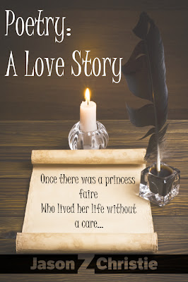
BAM! My poetry book, the tiniest but most important jewel in my publishing crown, is reborn anew.
 Before After
Wow. It makes me wonder why I don't follow his lead and not use photographs for the covers. It looks like my mine went through a transforming time machine of hotness.
But wait, you say. Hurricane Regina is a pretty important book of yours. Using all of what you've learned about cover design, did you manage to create something that's maybe, I don't know, half as compelling as what Humble Nation does?
No. What I managed to do was something ten percent better than my first cover, which only the muse and I liked.


An improvement. The cover was one of the reasons cited on "Why is My Book Not Selling?" The color scheme is bad, the text is all wrong, and the image is stolen. Only CL's logo design lends it any credibility at all. What's all that wasted space? It's not artful, it just looks amateurish.

Bam!
He actually sent two for this one, with a blue and a pink background. Given that it is sort of a female-oriented novella, the pink sort of says 'girl' without being patronizing. A bold look, furthermore. Note the simple and effective use of text. Note the patented subtle shading employed throughout. It's like some sort of unreproducible watermark.
So we see, a skilled cover artist can do more with a single piece of clip art than most of us can do with all of the world's graphic arts resources at our hands. CL Smith of Humble Nations, your image makeover expert.
I don't know about you, but I'm excited about the upcoming holidays...
"Look, " he says. "Some of your covers are still a bit naff. Even the ones you didn't manage to ruin entirely still can't compare to my work. Here, let me help you out..."
BAM! My poetry book, the tiniest but most important jewel in my publishing crown, is reborn anew.


Wow. It makes me wonder why I don't follow his lead and not use photographs for the covers. It looks like my mine went through a transforming time machine of hotness.
But wait, you say. Hurricane Regina is a pretty important book of yours. Using all of what you've learned about cover design, did you manage to create something that's maybe, I don't know, half as compelling as what Humble Nation does?
No. What I managed to do was something ten percent better than my first cover, which only the muse and I liked.


Before After
An improvement. The cover was one of the reasons cited on "Why is My Book Not Selling?" The color scheme is bad, the text is all wrong, and the image is stolen. Only CL's logo design lends it any credibility at all. What's all that wasted space? It's not artful, it just looks amateurish.

Bam!
He actually sent two for this one, with a blue and a pink background. Given that it is sort of a female-oriented novella, the pink sort of says 'girl' without being patronizing. A bold look, furthermore. Note the simple and effective use of text. Note the patented subtle shading employed throughout. It's like some sort of unreproducible watermark.
So we see, a skilled cover artist can do more with a single piece of clip art than most of us can do with all of the world's graphic arts resources at our hands. CL Smith of Humble Nations, your image makeover expert.
I don't know about you, but I'm excited about the upcoming holidays...


The typography really makes all the difference! Any correlation with sales?
ReplyDeleteMy sales are slowly rising across the board...
ReplyDeleteI hope to make enough to have him redo all of my covers, eventually. Mine feel like bad imitations. But my series is three books deep, and is really important to my catalog, so I think he's going to read them first before we try and tackle it.